Client
Venator
Solution
Brand identity and website design
Overview
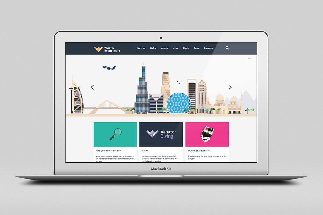
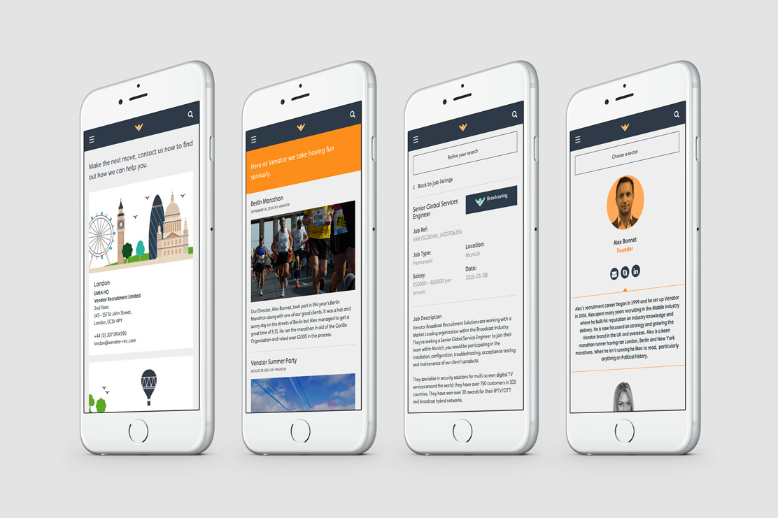
Venator approached Parent initially to update their website. Following a detailed review, it became clear that the Venator brand was suffering from a lack of guidance and coherence across the divisions within the business.
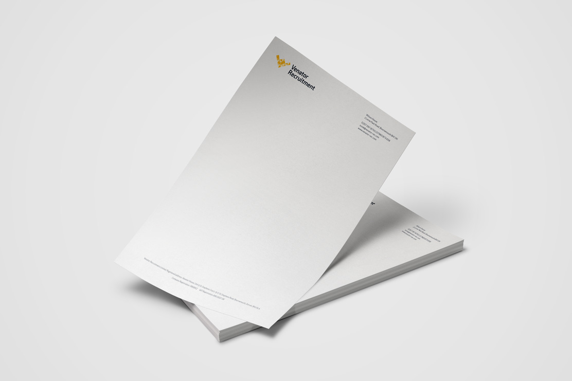
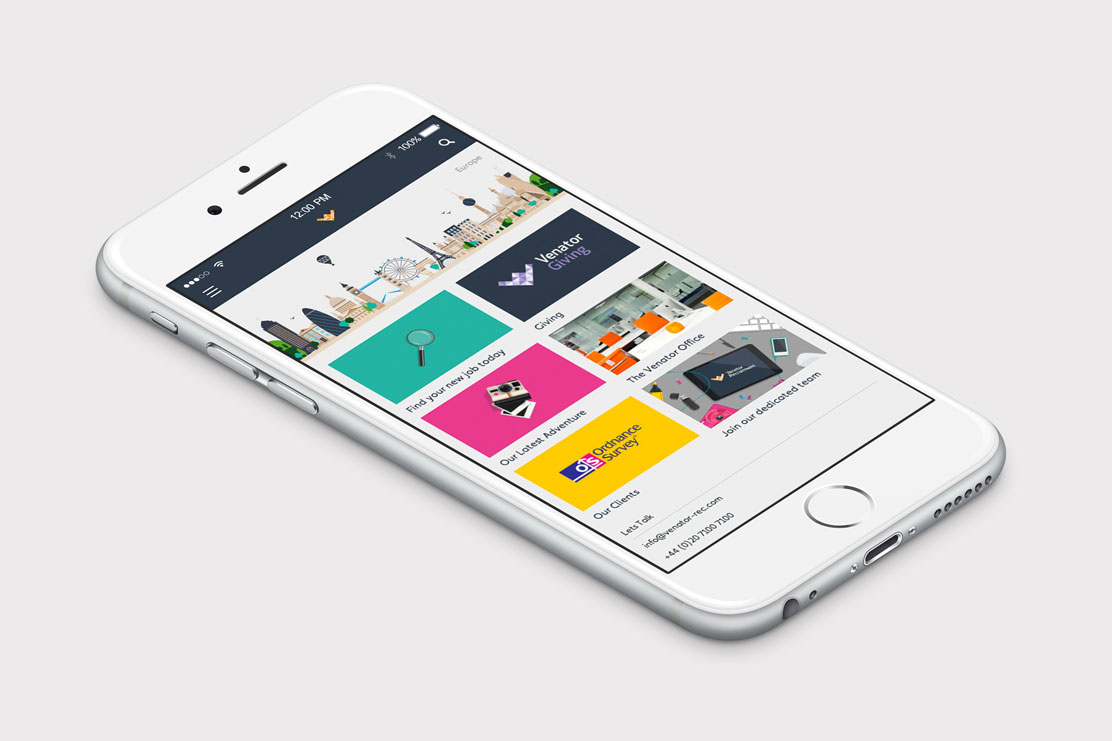
Parent created a full brand identity design, providing clear structure and a consistent appearance across the various trade divisions that Venator works within. With a name that stands for ‘hunter’ in Latin it was important to convey a sense of targeting within the identity, but also illustrate a modular, friendly attitude.
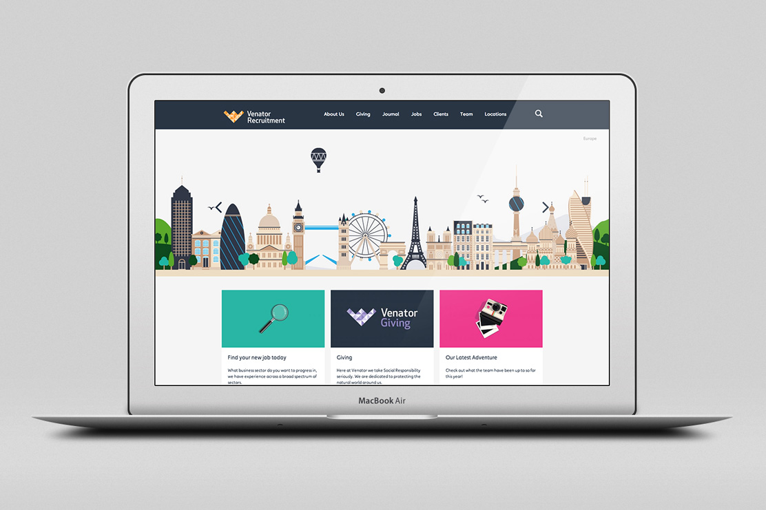
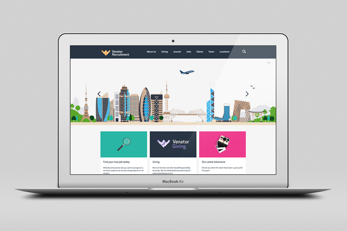
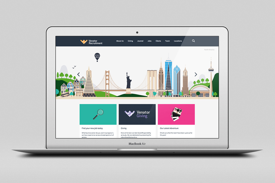
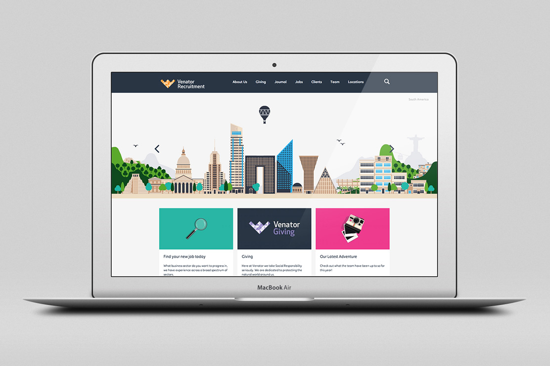
A broad reaching, friendly colour palette was used along with mosaic tints to create the ‘V’ arrow marque that supports the strong, simple typography. Illustrations were commissioned to convey the various corners of the globe that Venator’s work spans, creating a unique landscape and an identity that stands out from the usual suspects within the industry.
 venator-rec.com
More
Branding, Illustration, Mobile, Online, Print, Responsive, Typography


 Up
Up


